A sketch of one of the Entrance tower of the Castel Vechhio. Conveniently, there was a patio serving beer right across from this… 🙂
Bruce Thomson's Sketches
A sketch of one of the Entrance tower of the Castel Vechhio. Conveniently, there was a patio serving beer right across from this… 🙂

 This is a re-do of the last post, done by sketching out the tones first and adding the tint later… Better looking, on the whole, I think.
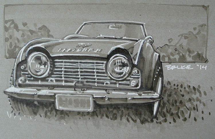
 I picked up a small “toned” sketchbook and a white gel pen (have seen some of my students using these pens to great effect). This is my first sketch in the book… I was originally going to do it simply as a “negative sketch” (white on tone) but got carried away and added the darker tones which give this a bit of an unusual look, as white doesn’t work as an outline when you have tone… Perhaps I should have left it. Next time I’ll start with the marker as a roughing in layer and go in with the gel pen later.
Still – fun medium, and I love these cars… Michelotti did a great job on these.


A bit of a departure. I’m not very good at “portraiture” or people, but I try, every once in a while. This is a sketch of Che Guevera, for a friend, from the famous Alberto Korda shot. While looking up good images to work from I discovered the original photograph, uncropped; in it, Che is leaning a little to his right, and the effect is one of casualness, or “ease”… amazing – tilt the portrait about 5 degrees (as it is always portrayed) and it morphs into pained nobility… 😀

First pencil sketch I’ve done in a while… a little muddy… too much HB, too little 4H…!

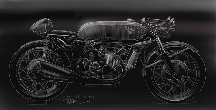 Another lash at sketching on the Wacom. This is less “sketch” and more drafting as I used the “ellipse plotting” tools pretty extensively here given the fact it’s a side view. Again, had intended this to be a quick sketch and then went and spent hours on it. Need to loosen up a bit… still reasonably happy with the result. Like the white on black – it’s always a good look.