
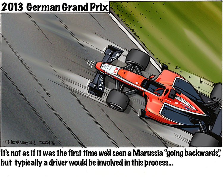
Better late than never? I tried to skive off this with the excuse that last Sunday was my B-day, but I have had enough requests to get off my arse and produce a cartoon that I have done just that – enjoy…
Bruce Thomson's Sketches
Better late than never? I tried to skive off this with the excuse that last Sunday was my B-day, but I have had enough requests to get off my arse and produce a cartoon that I have done just that – enjoy…

…or “a triumph of detail over content” … or “the anti-Braun”. Not sure why I did this. Just got started and got carried away. Still, there are mornings when I would like this to be the coffeemaker that greeted me…
No cartoon this week – Sorry! it’s my birthday today and I’m taking time off…
Cheers – Bruce
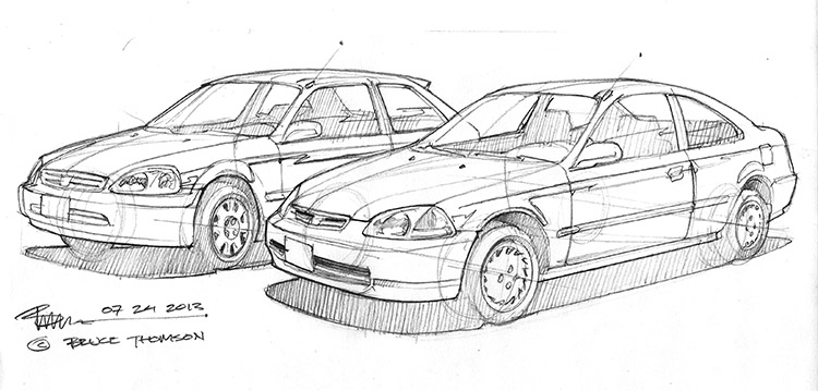
A sketch I’ve done for a client who wishes to have his old Hondas painted. This is one rough of several to show the client different views and compositions. Drawing 2 cars together is always tricky, because if you draw them in the same perspective “grid” they look unnatural, but if you don’t they can look out of perspective…

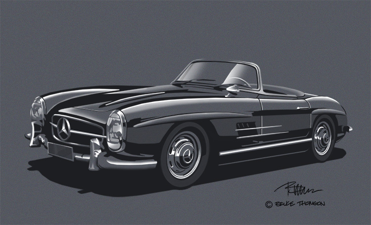
This was a tricky one. I was giving this the same treatment as the previous post (the Mercedes coloured paper rendering) but it just wasn’t looking “right”. In the end, I took the sketch layer from the base and put it on the top layer, “multiplied” it and knocked back the opacity to about 35%… and suddenly it looked good. I think so anyway.
This is a much simpler subject than the previous post, but it took more time to do – simplicity is hard to catch, and “off white” is hard to render…
“Coloured paper” is in quotes – as this is entirely digital. This is an old Industrial Design rendering technique I teach my students (for “real” examples of this see my website under “renderings”). It’s a tricky one to learn and hard to do correctly – however, it works amazingly in the digital format. Essentially you take your sketch in, establish a “paper” (or background) colour and then simply dodge and burn, or alternatively, render in black and white. I suspect I’ll be knocking off a couple of these in the next few weeks…
I always like the look of these. The car is nice too… 😉

A rather “too careful” colour rendition of the earlier Polski Fiat sketch.
This is a sketch I did back when I was in England – about 2005, I’d guess. I found it on an old hard drive – the actual sketch is long gone. You’ll notice that the quality isn’t great – for some reason, the only image I saved was 72 dpi at 450 pixels..! I really should “archive” my work better.
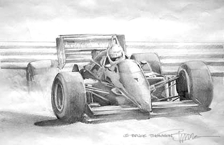
I like the sketch – particularly the reflections on the nose…

Sat on at Pub terrace to draw this one – and the perspective mistakes have nothing to do with my beer consumption!! This is a tricky sketch because of the “double” downhill slant to the front corner of the building… I made the mistake of starting there and building up – if I’d been smart, I’d have started with something “static” like the horizontal lines that define the upstairs windows or something… live and learn.
